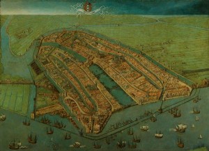
 @Helen_Olney wondered why on several old maps of Amsterdam, South is at the top. The answer to this question has a number of layers.
#askacurator: on several old maps of Amsterdam, South is at the top. Why is this?
 @Helen_Olney wondered why on several old maps of Amsterdam, South is at the top. The answer to this question has a number of layers.
In the case of Amsterdam the reason for an orientation with the south on top has to do with city pride. One of the earliest and powerful examples of such an oriention is the birds eye view of Amsterdam by Cornelis Anthonisz which dates from the 1540s. With such a view the harbour front is made into the main focus for the viewer. In this way the viewer is given the impression that the harbour is of prime importance for the city.
So quite often orientation has something to do with psychology or power: what do we find most impressive, what do we consider most important. A relatively modern example of such power psychology is the east orientation of a birds eye map of New York and the rest of the world. On this view Manhattan is enormous, the rest of the US relatively small and Asia is a tiny island in the background.
Another reason for not choosing the north orientation is simply because there was no standard for doing so. North orientation nowadays has become a more or less absolute law. But compare it with new technologies: usually it takes a while until a standard is agreed upon (I still have to see a mobile phone which operates like the one I had before).
And another reason for not choosing a north orientation can be based on practical reasons such as the standard size of the paper that was used or the sheet of vellum/parchment. For instance the vellum of a cow is not square but rectangular. So if you have to draw a map of let’s say Portugal one can imagine it is practical to use a west or east orientation: the easiest way to fit Portugal on a cow!
Alle rechten voorbehouden
117 keer bekeken
